Visualization and Visual Analytics
About
Link: https://www.transparency.org/gcb2013/country?country=united_states
Transparency International provides an interesting look into peoples' opinion of corruption within their own countries and how much impact they believe they have on this corruption. There are multiple beautiful graphs provided for 107 countries. The accuracy and merit of those graphs are expressed in detail below.
Data
114,270 people were surveyed in 107 countries. Large countries had 1,000 people surveyed within their metro areas. Smaller countries had only 500 participants. It is important to note that there is some bias in surveying only those who live in metropolitan areas. Of those people, they were asked 7 questions and many of the questions focused on 8 specific institutions (such as media, education, etc.) and their levels of corruption.
Data was collected by survey companies on behalf of Transparency International. From September 2012 until March 2013, surveys were collected through telephone, face-to-face, and online surveys. The questionnaire itself is reviewed by Transparency International’s Index Advisory Committee which is a group of experts in areas of corruption, statistics, and research. The result are verified internally and through a third-party survey expert. Some countries follow different rules and regulations, and deal with Transparency International charters of those respective countries.
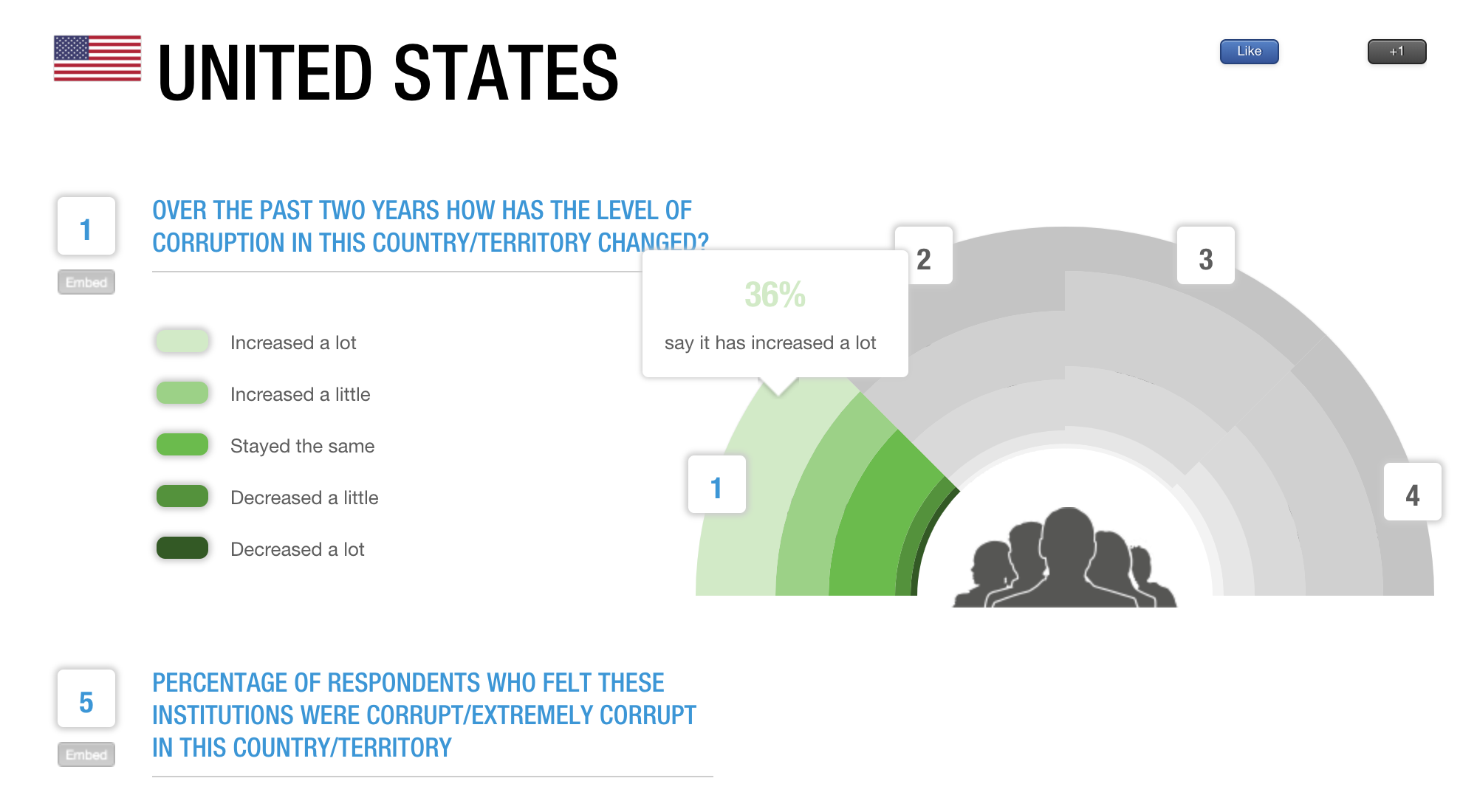
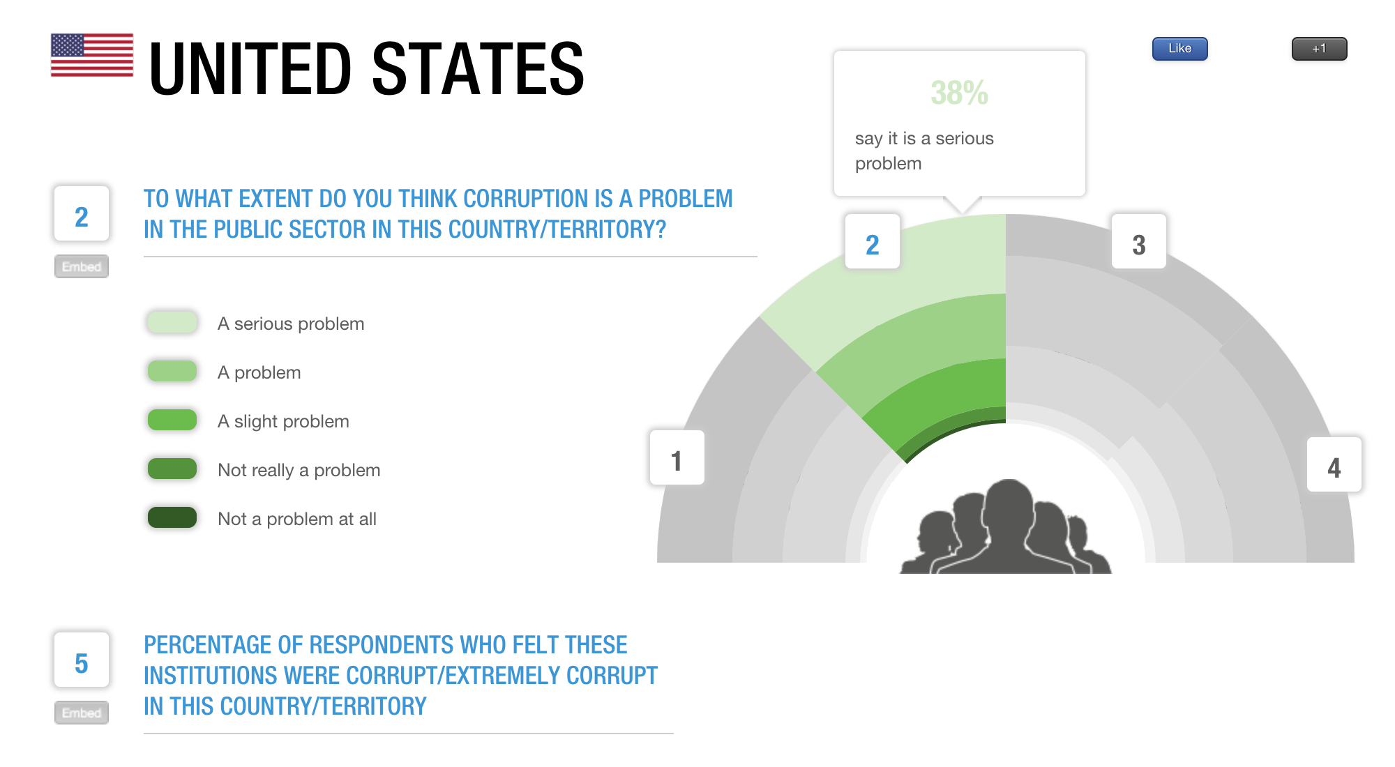
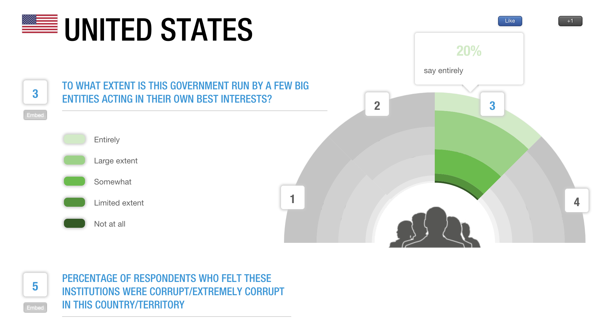
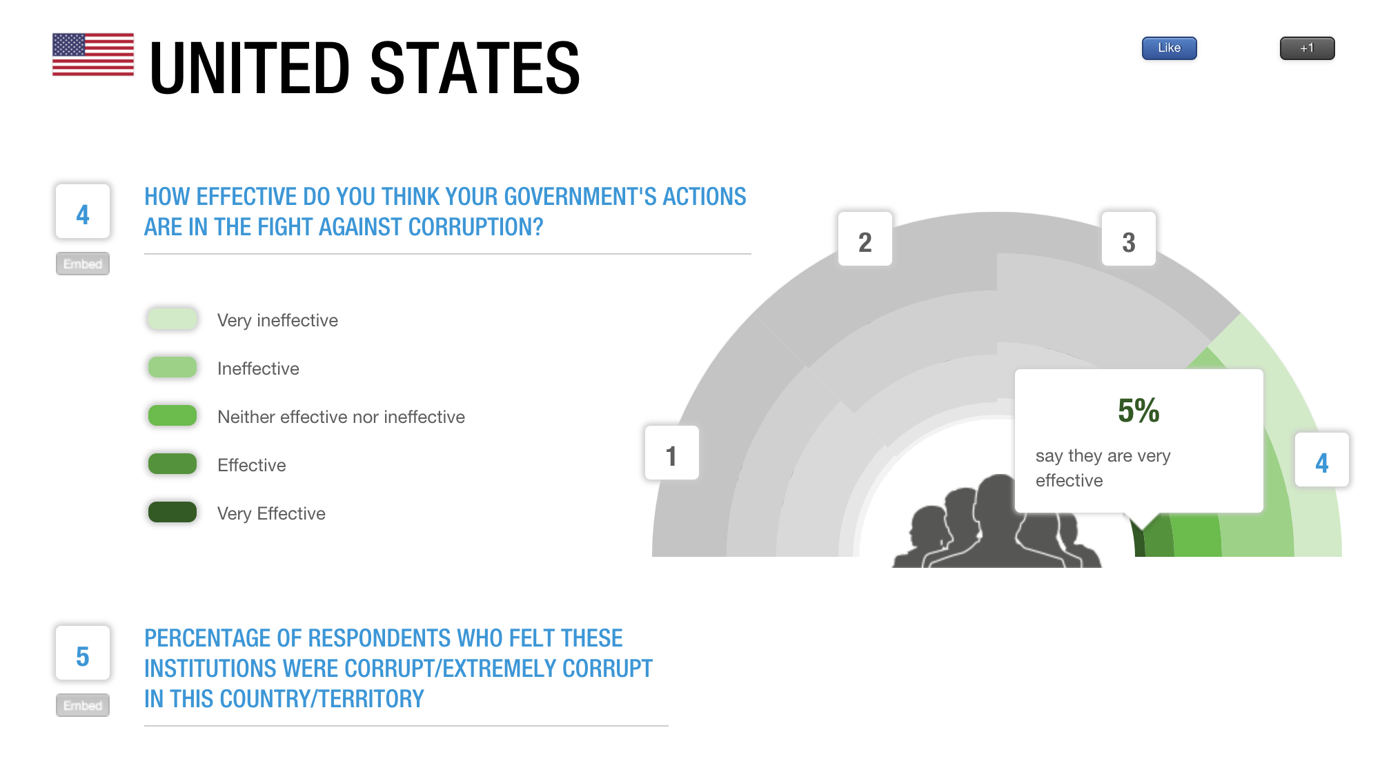
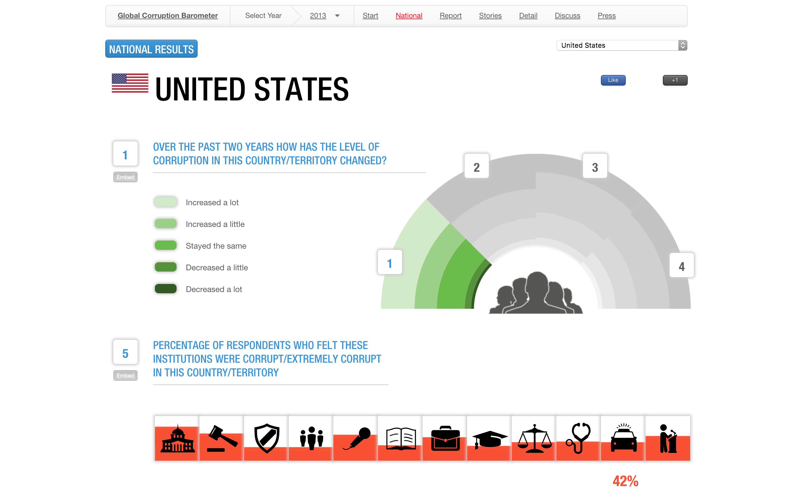
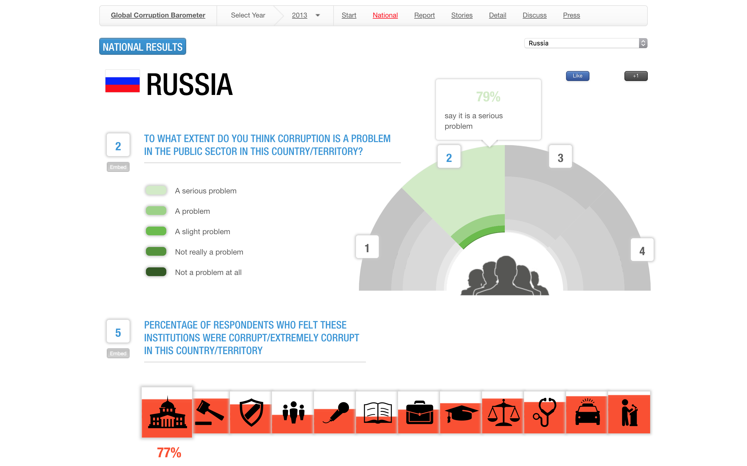
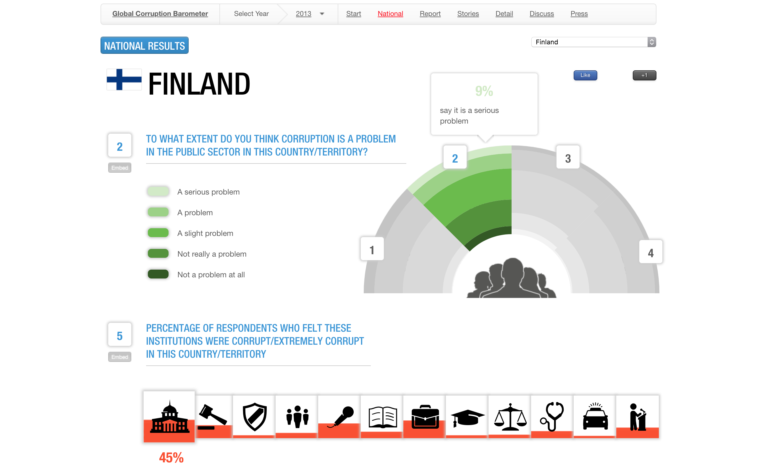
Graph 1
The first visualization shows a subset of questions asked regarding peoples’ opinion on corruption within their government. This graph isn't intuitive. When the users looks at it, there are 4 subsections of the arc graph. The user might click a non-active section but nothing happens, they must click the number above the subsection, not the box or the section itself. This can be very confusing as the average user will only try one or two different ways of selecting a subsection before they stop altogether. Furthermore, there is no reason to keep these statistics in the same arc graph. To see the percentages associated with each band, the user must hover over it which means if they want to compare answers they must hover over each band versus being able to see it just by glancing. Positives for this graph is that a light color always corresponds with high corruption, regardless of what the question is focused on.
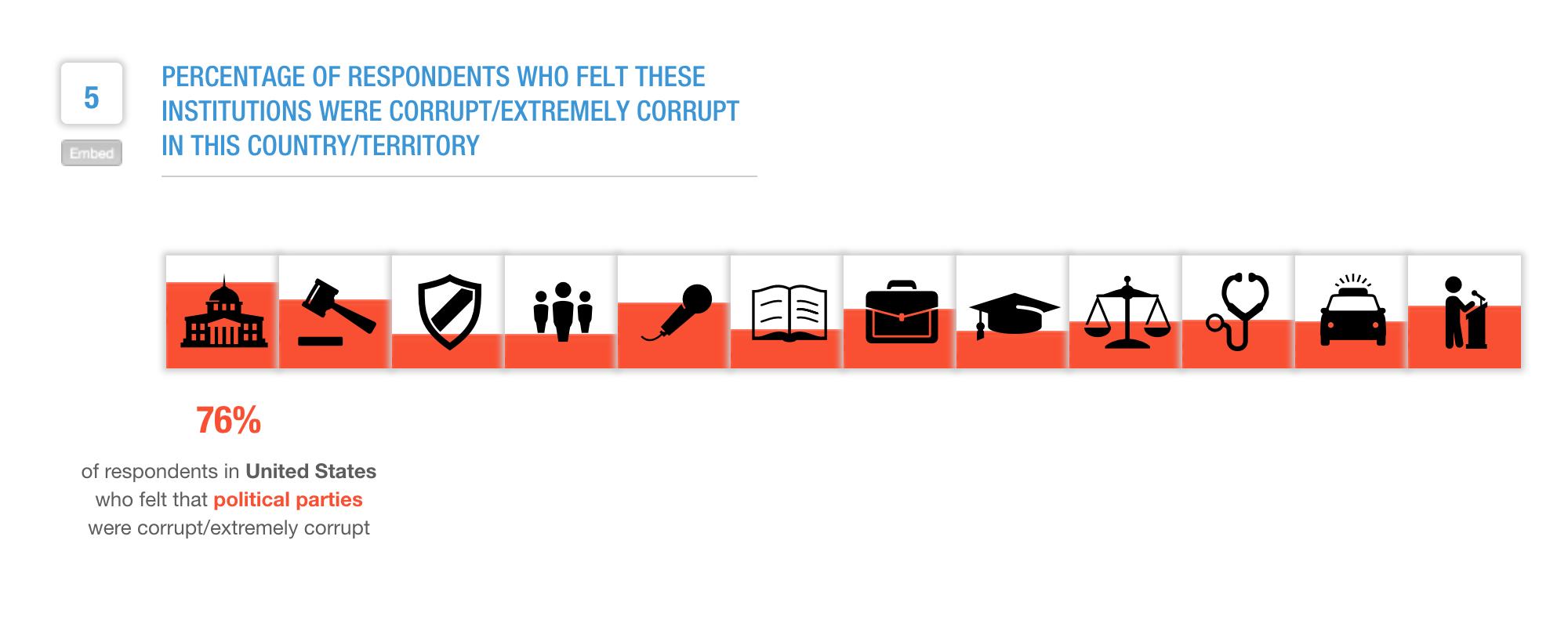
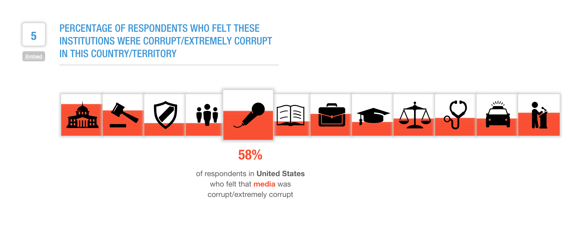
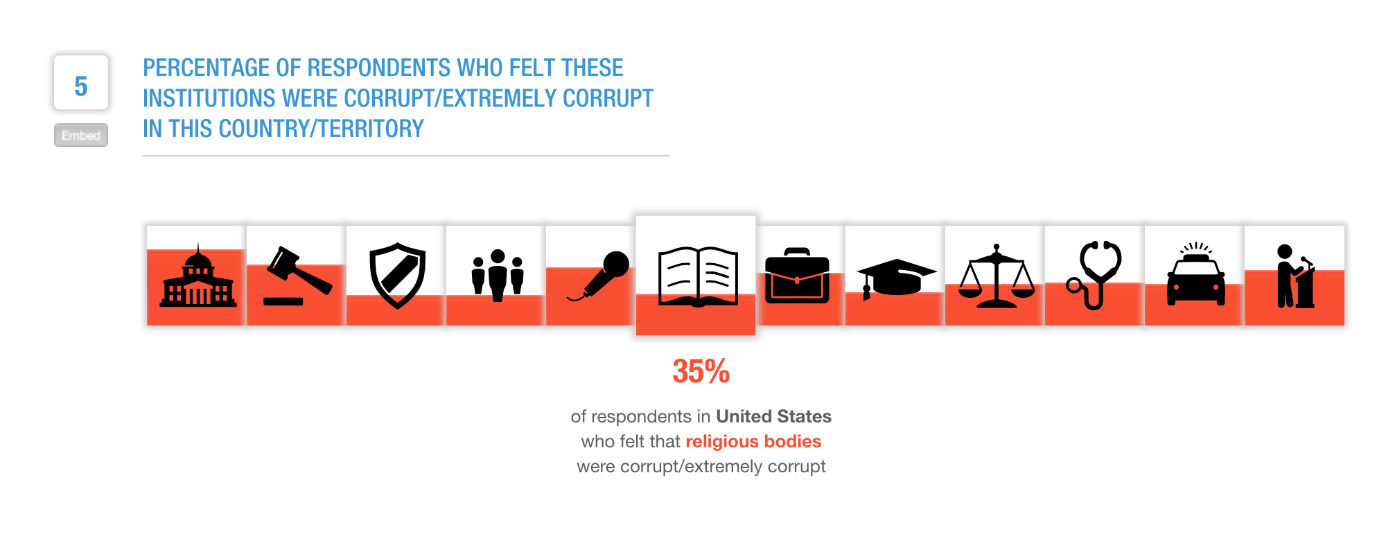
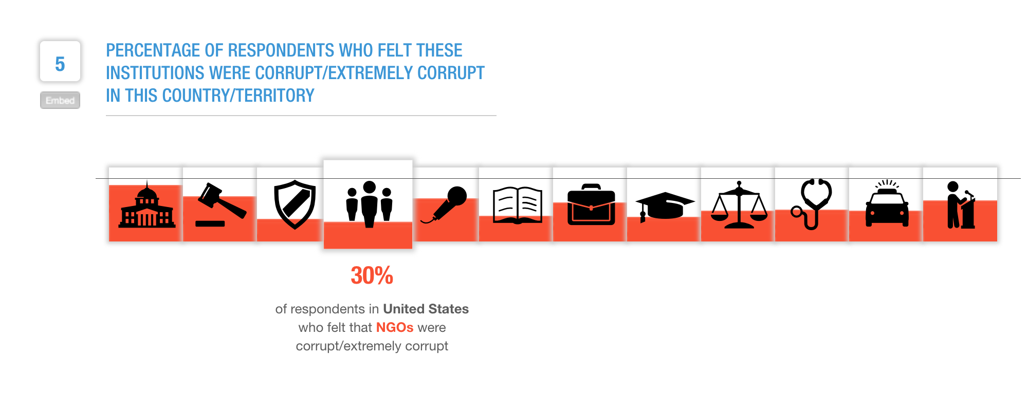
Graph 2
The second graph displayed shows participants opinions on corruption within specific institutions of their government. This graph is also not as intuitive. There are some icons which do not represent their category well, as seen in figures 2 and 3. It is difficult to compare different subsections of the data. To get a value for each different institution you must hover over it. As icons are different sizes, it is difficult to compare categories to each other by eye and again the user is forced to hover over each one, remember it, and then compare (this can be seen in figure 4). The red fill color works well with this graph as it is usually associated with a negative connotation.
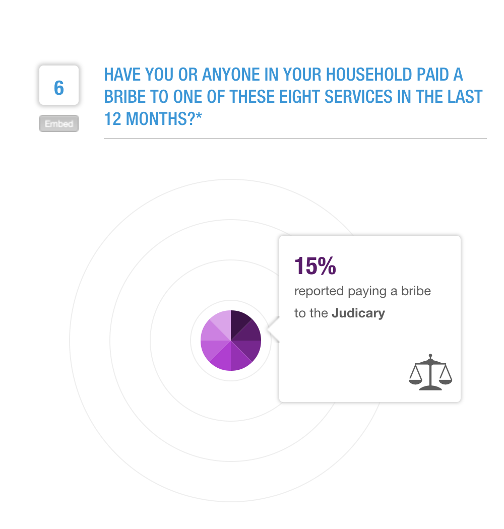
Graph 3
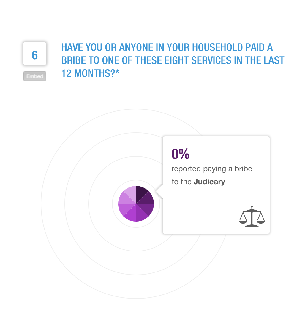
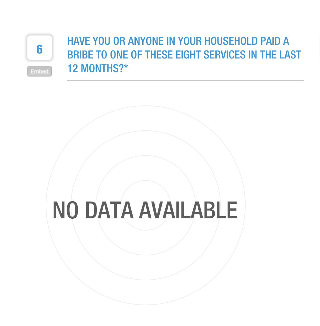
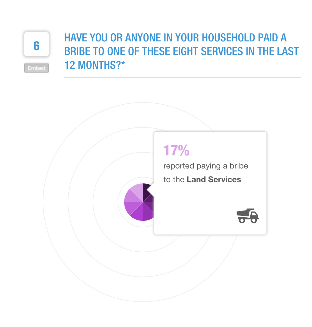
The third graph illustrates the amount of people who have paid a bribe to an institution of their government within the past 12 months. There are many issues in this graph that all boil down to how data is shown for each slice. When there is a percentage of 0 reported for an institution, the slice is still seen on the graph, and it has the same size as other institutions that have a much higher percentage, such as 17% (this can be seen in figure 2). The width of the slice does not correspond with its value. The height does correspond but only in certain ranges. This can be seen as skewing the data as at a glance the data seems much different than if you were to hover over it and look at it in-depth. There are also many countries where that data is not available which brings into question weather or not they should have included the statistic in the first place (as seen in figure 3). Ironically, countries with higher reported corruption did not seem to have this data available. There are also new categories that have not been seen before, such as land services (as seen in figure 4). The icons found in this visualization correspond to the icons from the previous so there is continuity. The outer rings seem to correspond to the range of height but there its no legend or values so as with all the other visualizations, you are forced to hover over subsections to compare or get accurate values. The colors for this graph are not good as the color means nothing and correlated with nothing else on the page but serves as just a way to see different slices.
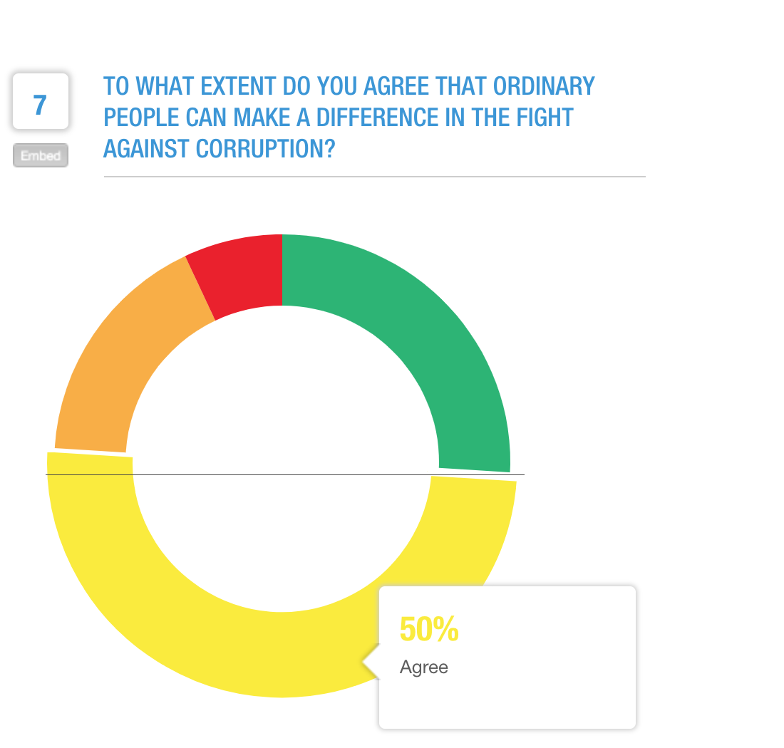
Graph 4
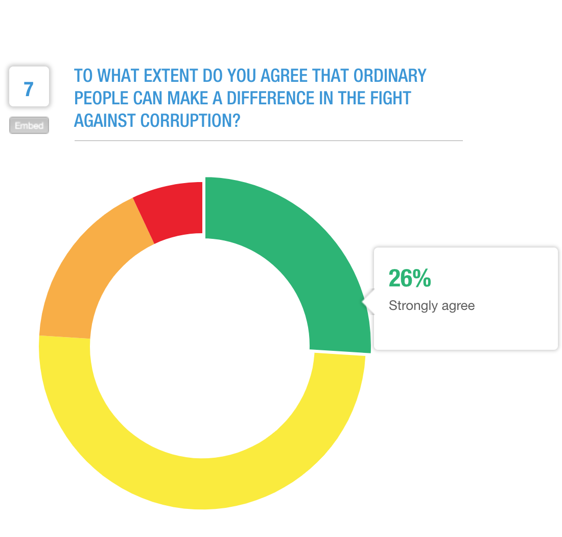
The final graph shows how many participants felt like the average citizen could change the corruption of their government. For this donut chart, there is only one issue. The chart does not seem to start at 0%. So when 50% of people agree it does not look like 50% on the graph as it is not a straight line (as seen in figure 2). Just like with all other graphs, you are forced to hover for accurate values. Not starting the donut chart at 0% could also be considered skewing data. The colors of this graph are good as the green is considered a positive answer and the red is considered negative, as one usually expects. But this does not follow the color scheme presented in the first arc graph, where a more positive answer was displayed in lighter color not a different color completely.
Conclusion
What works:
There is a minimal amount of features that seem to work. It strongly feels as if the graphs were made as they currently are for a 'prettier' view and not focusing so much on specific numbers but general ideas. This is also evident when you consider how the data was collected and that a person's opinion isn't always a good marker of what is actually occurring and that this data is again more of an overview or quick glimpse of the data.
What needs improvement:
- For all graphs, values need to be shown without forcing the user to hover over that section.
- For the second graph, comparing data would be much easier if it was simply one bar graph with a bar for each institution versus multiple essentially bar graphs with one bar of data in each.
- The third graph needs a complete overwork to make any sense, again I would suggest a bar graph so there is also a sense of continuity between these different graphs.
- The final donut graph needs to simply shift over where it begins so values do not seem skewed.
- Color wise, it would be more efficient if there was one concrete color scheme used for all graphs. Currently green can be a positive thing in one graph or a negative thing in another.
- It would also be useful to allow a user to select multiple countries and compare values between those two so more context and information is provided.
Impact
Who:
This visualization was made for a plethora of people. The average citizen can use it to explore different countries and see how their own outside view of corruption within a country compares to what actual citizens of the country feel. It can also be used by policy makers to focus on issues that citizens feel are important and have more insight on what people perceive about individual institutions. It can be used by researchers as Transparency International has data for many countries that spans several years and can be interesting in seeing changes of public opinion over time and in relation to major politic events in those countries.
What:
People may want to ask the following questions
- How corrupt is a country?
- How corrupt is a country in comparison to another country?
- How corrupt does a corrupt country perceive itself? Vice-versa, how corrupt does a non-corrupt country view itself?
- How common are bribes in certain countries?
- What institutions are usually considered the most corrupt? The least?
- In relation to how corrupt a country is, how powerful do the people feel in being able to change it?
- How much has public opinion on corruption changed for a specific country? How much has it changed for the entire world?
How:
Users can find answers to these questions by selecting different countries and comparing data and by analyzing the result for each specific country. This tool provides the answers to all those questions.